Layout Manager
Cross Platform Layout Manager for Android and iOS
Introduction to SCADE Layout Manager
The layout manager houses and handles all kinds of controls in a precise fashion on a mobile app page. It automatically adapts to the respective screen size and therefore achieves device format independently. The layout manager makes use of layout containers to display mobile pages.
General Layout Properties
There are some shared attributes across all four layout containers. These shared properties can be found and configured in the layout panel located on the right side of the IDE:
Paddings
The padding settings define the space between the layout container and its content. Increasing the padding value moves the content(s) of the container inward. The values are absolute values in points:
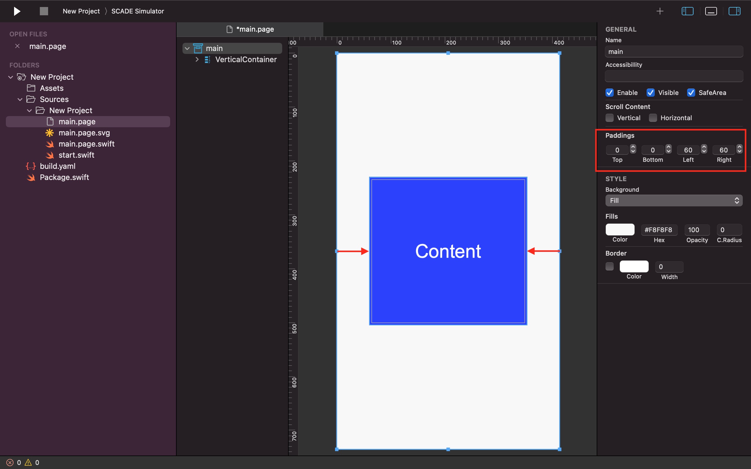
Spacing
This property defines the distance between controls and layout containers in a given container.
The spacing attribute means different things for different layout containers, and it can be found in the layout panel of a particular layout container:
- Grid Layout container supports both vertical and horizontal spacing.
- Vertical Linear Layout container supports vertical spacing.
- Horizontal Linear Layout container supports horizontal spacing.
- Spacing is not supported for the AutoLayout Layout container.
Scroll Content
You can add a scrolling functionality within a container through the layout panel. The Scroll Content feature has two parameters - Vertical and Horizontal. You check the Vertical parameter to give a layout container the ability to scroll vertically, and you also have the option to select the Horizontal checkbox if you want the effect horizontally:
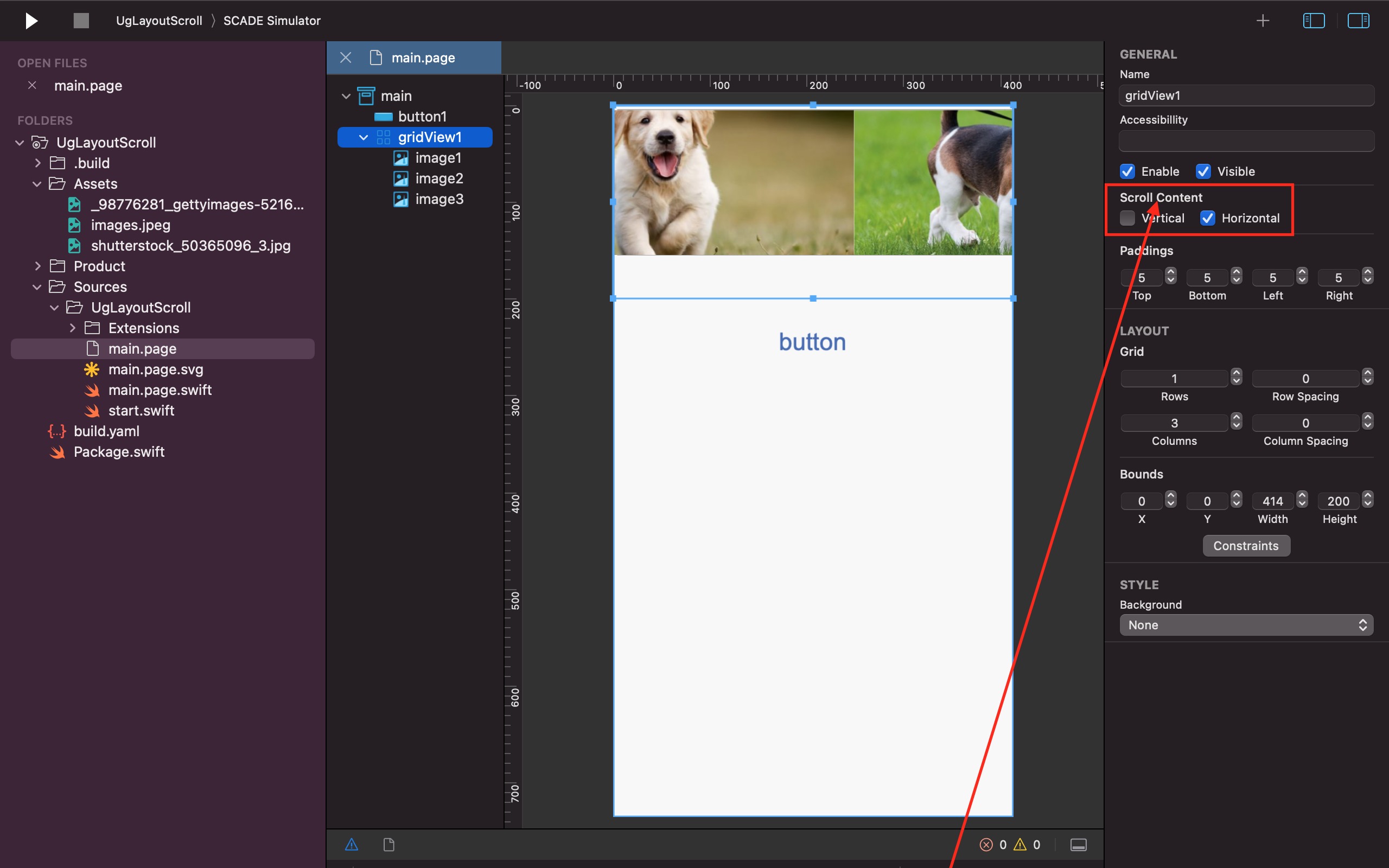
We check the Horizontal parameter in the layout panel of the gridView1 layout container to enable us to scroll its children horizontally. The result of the aforementioned adds a ScrollableBox to the gridView1 layout container:
How to Scroll to a particular Position
To scroll to a specific position, let in our case, scroll to the middle of the scrollbox, we:
- Give the scrollbox an id to identify it. For example, in the screenshot below, we used sg1:
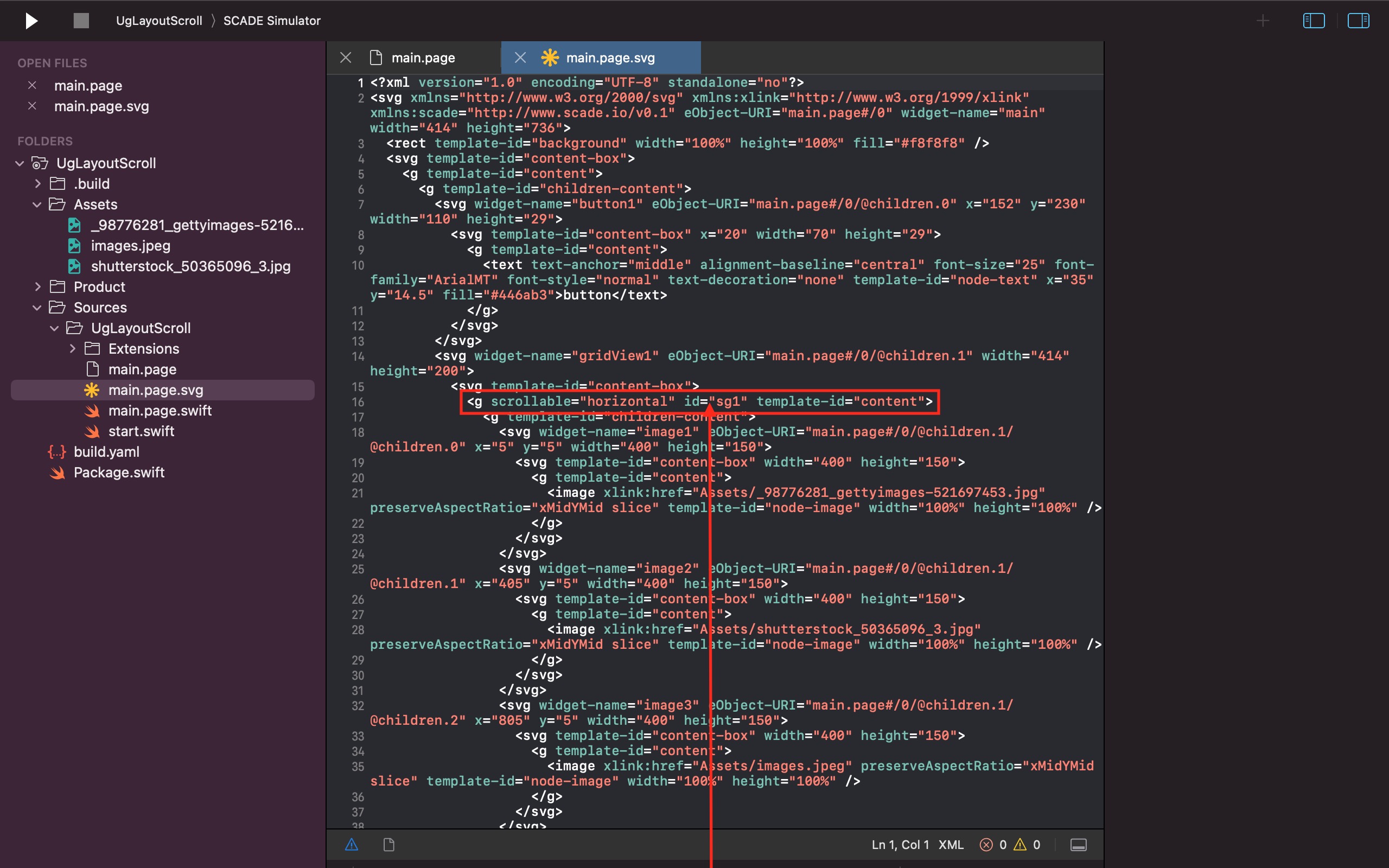
- Get the handle on scrollbox using the self.page!.drawing!.find(byId:) method.
- Determine the total size that the scrollbox encloses using .getContentSize().
- Calculate the position you want to scroll to.
- Scroll to your preferred position using .scrollTo(positionToStrollTo, y: 0).
func gotoMiddle() {

  // Get scrollbox
  let scrollbox = self.page!.drawing!.find(byId:"sg1") as! SCDSvgScrollGroup

  // get total size, i.e. the width and height of entire scrollbox
  let contentSize = scrollbox.getContentSize()

  // the scrollbox.width :  visible part of the scrollbox
  let position = (contentSize.width  - scrollbox.width) / 2
  scrollbox.scrollTo(position, y: 0)
}
Bounding Box
A bounding box is a very important concept to understand layout behavior. Bounding boxes are used in all kinds of graphic tools (Adobe, Sketch, etc.).
A bounding box is a rectangle that encloses visual controls, i.e., containers or widgets (such as a horizontal layout container, labels, buttons, and so forth). It defines the area in which an item can be placed.
Basically, a bounding box can have three sizes:
- Minimum size: where the size of the bounding box and the visual controls are the same.
- Maximum size: where the size of the bounding box covers as much area as possible and is only constrained by its parent.
- Custom size: where the width and height are set by the developers. The custom size option is rarely used.
Wrap/Fill - Setting min and max bounding box
The Wrap/Fill feature, located in the layout panel, controls the behaviour of bounding box . You can use its elements to configure the size and position of a bounding box and its child.
Clicked | Wrap Content in Minimal Space | Wrap Content in Maximum Space | Expand Content in Maximum Space |
Horizontal Wrap/Fill | Bounding box has the same width as its child. | As much space as possible is grabbed/used horizontally | Bounding box's child stretches to the border-width of the bounding box's parent container. |
Vertical Wrap/Fill | Bounding box has the same height as its child. | As much space as possible is grabbed/used vertically | Bounding box's child stretches to the border-height of the bounding box's parent container. |
The bounding box of an item will extend itself in a vertical or/and horizontal direction until it reaches the borders of its parent container if the maximum size bounding box is chosen.
And if you choose the minimal size, the bounding box will always be the size of its visual control:
You can only freely change the position/location of a visual control in a bounding box when you choose the maximum size. Otherwise, you won't be able to freely move around a visual control if it has the same size as its bounding box:
Also, you would be restricted from moving visual controls around if you expand a bounding box's child to reach the borders of the bounding box's parent container:
Configuring Bounding box Programmatically
let gridData = SCDLayoutGridData()
// Set the to true for maximum bounding box size
// set to false for bounding box to equal control
gridData.isGrabHorizontalSpace = true
gridData.isGrabVerticalSpace = true

// In case of maximum bounding box (isGrabXXXSpace = true)
// we can set the location with the bounding box
gridData.horizontalAlignment = .center
gridData.verticalAlignment = .middle

// set width and height constraints
gridData.heightConstraint = .match_parent
gridData.widthConstraint = .wrap_content
Some Important Facts about the SCADE Layout Manager
-
The main.page (main) is the root container. Its type depends on the layout format chosen when creating a new project. For instance, if you choose the Auto-Layout format for a new project, your project's root container will be in that format.
-
Containers can contain each other.
-
You can create a hierarchy of containers to achieve the perfect layout for your project.
-
A pixel-perfect page layout can be achieved by simply combining multiple layout containers of the same type or different types, or by using just a single layout container for a project.
SCADE Layout Types
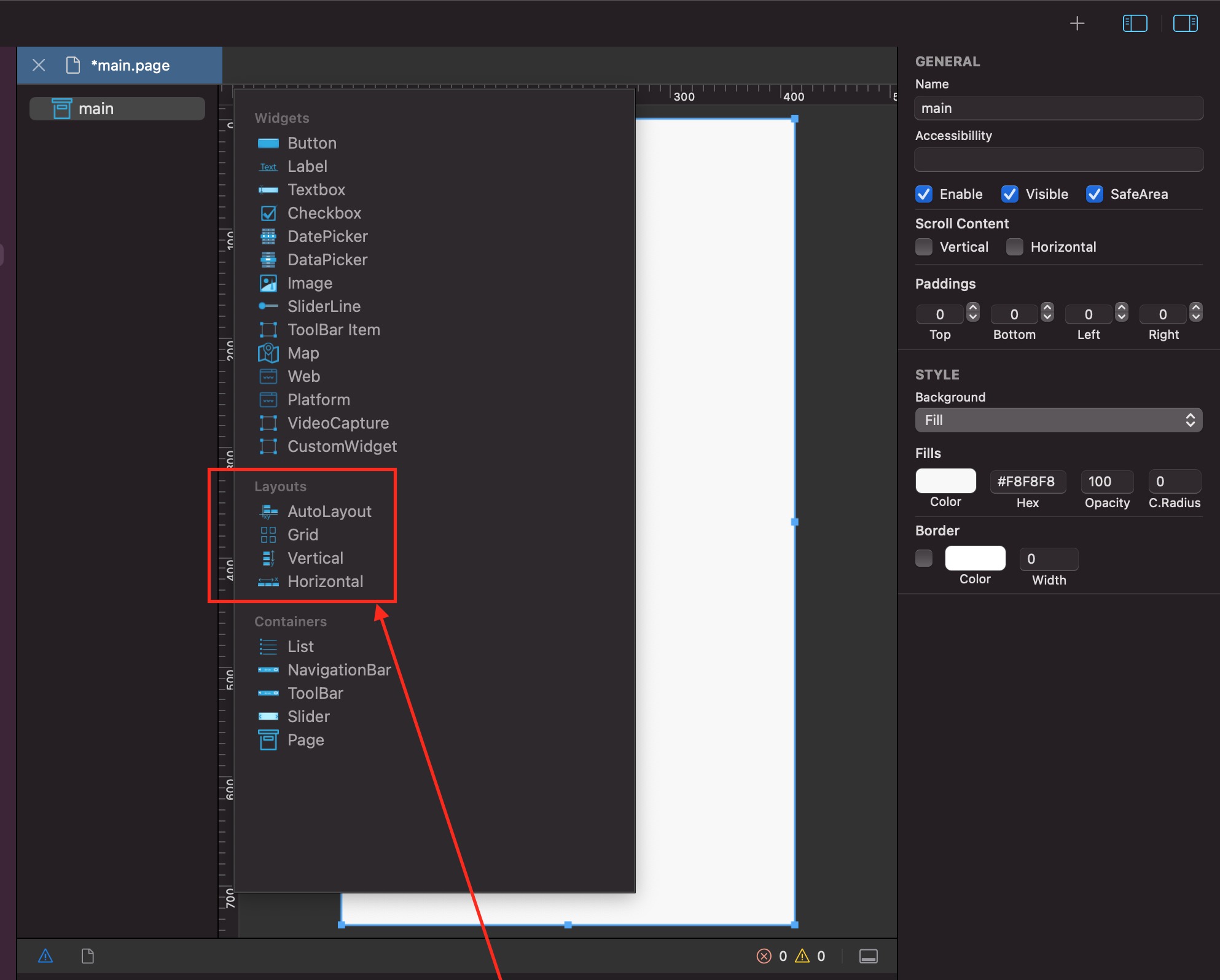
Currently, SCADE has four major Layout Containers:
-
AutoLayout Container: AutoLayout aids in dynamically calculating the size and position of each control, widget, and other containers put inside it on a page based on the constraints placed.
-
Grid Layout Container: A general-purpose layout container with a matrix-like format that compares objects along two axes.
-
Vertical Linear Layout: It comes in handy when you are trying to stack items (controls, widgets, etc.) vertically.
-
Horizontal Linear Layout: It is very useful for aligning items (controls, widgets, etc.) next to each other.
1. SCADE Auto Layout Container
The autolayout allows pixel-perfect placement based on the coordinates of its items. It produces a user interface that can adapt to numerous devices and orientations automatically. Additionally, it's also highly sensitive to changing situations because of its adaptability and versatility.
An AutoLayout container may be the root container of a page, and it may also be inserted into other layout containers to achieve a beautiful responsive UI design.
However, Autolayout doesn't use layout concepts such as alignment and fill-space, unlike other layout containers. Interestingly, it dynamically calculates the size and position of controls based on the respective constraint values you set for these controls.
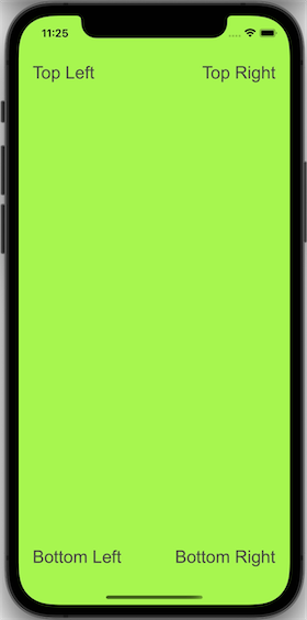
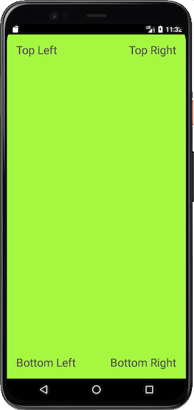
This short video places a label at each corner of an AutoLayout root container (main page) to demonstrate how to achieve a simple AutoLayout design:
Here's how the Simple AutoLayout Design look in both Android and iOS Simulators:
2. SCADE Grid Layout Container
Items in the GridLayout are arranged across two axes in a grid-like style. The grid layout can be the root container of a page that houses other inserted layout containers. Items inside a GridLayout can be other layout containers or user controls such as labels, buttons, list controls, and so forth. A grid comprises a number of rows and columns. A grid layout expands dynamically when we add more items inside it. For instance, adding a new label below an existing label in the last row of a grid creates a new row.
Some noteworthy details of the Grid Layout
The grid layout is an excellent UI design format that divides the screen into rows and columns to form an n x m matrix of cells.
- By default, each cell of a Grid Layout container holds exactly one control (such as a label, image, textlabel, and so forth).
- Insert another layout container that can hold many controls into a grid cell if you want to have more than one control in that cell.
- The height of each row of a grid is determined by the tallest control in that row.
- The width of each column is also determined by the widest control in that column.
Basic Grid Layout behavior
Here is a brief video demonstration of how to use SCADE's Grid Layout:
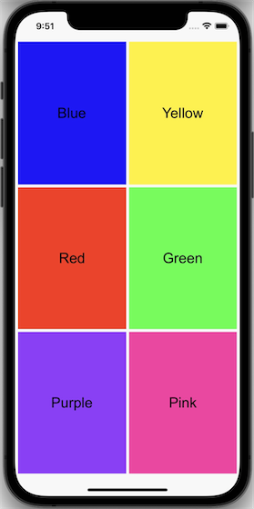
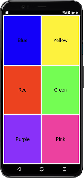
- Insert a grid layout container (named gridView1) inside a page that has a grid layout as its root container.
- Divide gridView1 into a 3x2 grid - 3 rows and 2 columns.
- Insert a label control inside every cell of gridView1.
- Change the background color of each label and also give them a unique name.
Set horizontal spacing and vertical spacing for gridView1.
The following screenshots show how the Simple AutoLayout Design appears in the Android and iOS simulators:
Size constraints in code
let gridData = SCDLayoutGridData()
// set width and height constraints
gridData.heightConstraint = .match_parent
gridData.widthConstraint = .wrap_content
3. Vertical Linear Layout
The vertical linear layout arranges items on top of each other. The vertical linear layout, unlike the AutoLayout and the GridLayout, cannot serve as a page's root container, but it can also be set to include other layout containers and user controls (such as the list control, button, textbox, and so forth). Notably, it has almost the same features as the GridLayout except that it only comprises a number of rows.
4. Horizontal Linear Layout
The horizontal linear layout does the opposite of the vertical linear layout. It also can't stand as a page's root container, but it can depend on its column property to arrange items such as layout containers, labels, buttons, list controls, and so forth next to each other in a group within the layout.
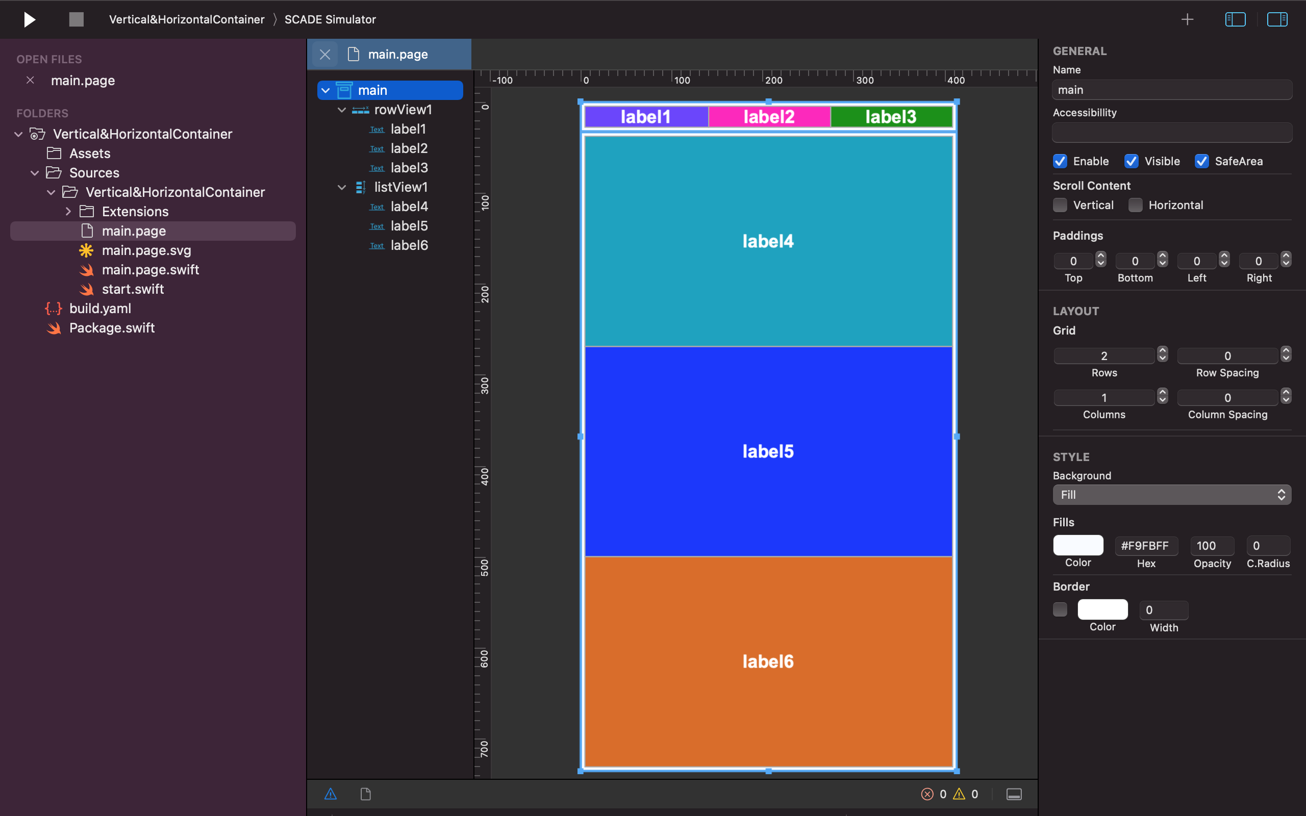
Basic Vertical and Horizontal Linear Layouts behavior
- Insert a horizontal linear layout into the root container.
- Divide it into 3 columns.
- Use the Wrap/Fill property to limit its automatic vertical expansion.
- Insert a label control into every of its cells.
- Wrap each label into maximum space.
- Change the background color of each label.
- Insert a vertical linear layout into the root container.
- Divide it into 3 rows.
- Insert a label control into every of its cells.
- Wrap each label into maximum space.
- Change the background color of each label.
- Align all six labels to the center of their respective cells.
Updated 2 months ago
