Slider control
Using slider control in Cross Platform Swift on Android and iOS
SourcecodePlease see the UgSlider project for the source code created in this chapter. See Installing examples for information on how to download the examples from <https://github.com/scadedoc/UgExamples/tree/master/UgSlider>
The slider control allows you to implement carousel-like functionality where you can swipe left and right to display different items.
Naming of controlThe current naming of Slider control and SliderLine control is a bit confusing. We will rename Sliderline control to Slider control, and Slider control to something like Scroll control in the future.
- What you know from iOS and Android as slider is called SliderLine
- Slider control is known as Carousel in iOS and Android
Slider Control Properties and Methods
Name | Description | Values |
|---|---|---|
selected:Int | Specifies which element of the slider's elements is displayed | 0 .. (number of elements)-1 Works only in the show() method |
elementProvider: SCDWidgetsElementProvider | Holds object that maps data to slider's elements visual controls. | |
onSlide:[SCDWidgetsSlideEventHandler] | Add event handler to capture slide events. The event has to and from attributes. | -1 if you try to slide left to the beginning and there is no more item
|
items:Any | List of items that represent the data that should be displayed | If you use a class, it has to inherit from EObject. |
elements:SCDWidgetsElement | List of elements. Elements represent the container for the visual controls displayed in the slider |
Design the page
- Add the slider control and use its layout properties to size and position it.
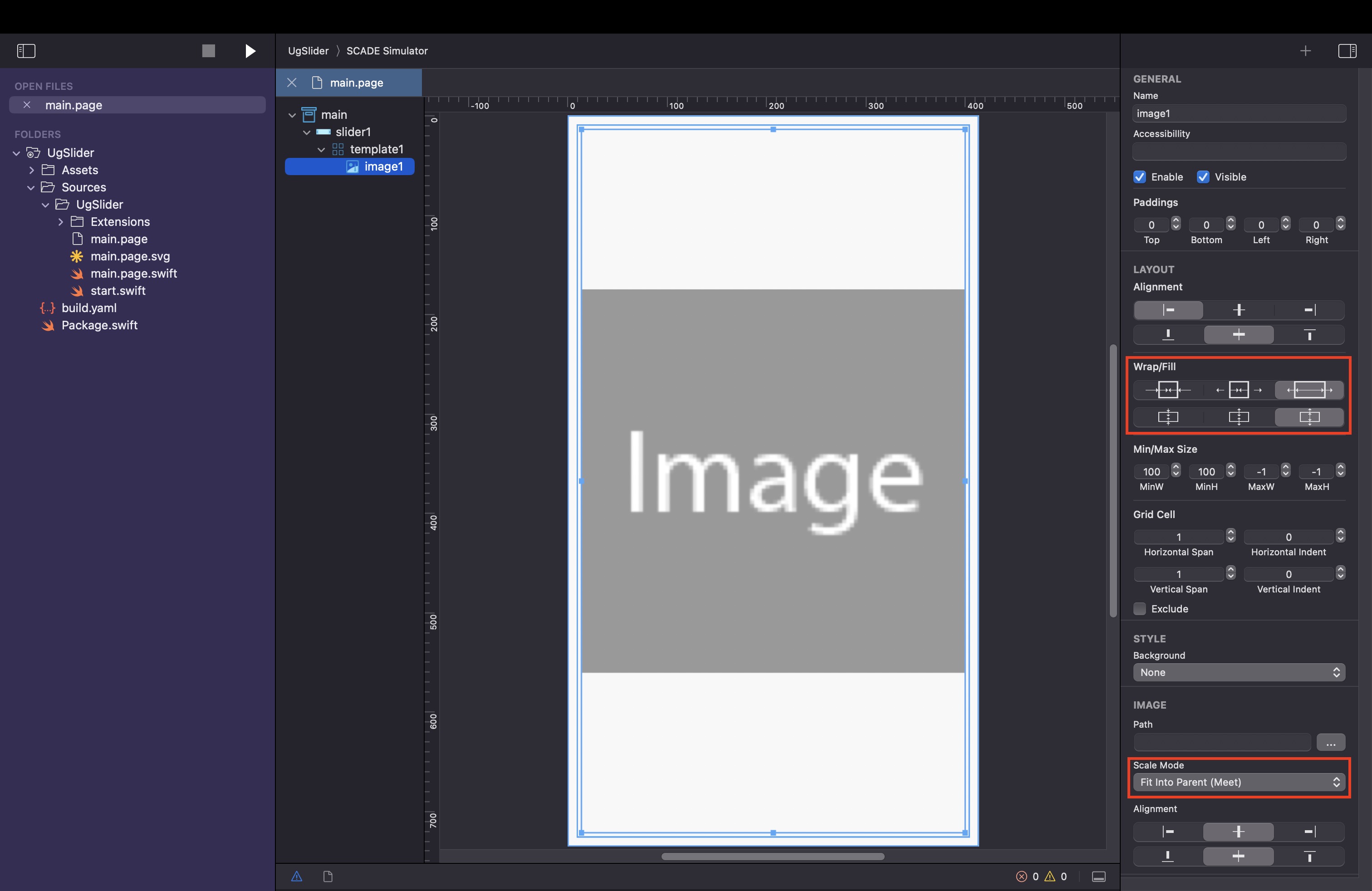
- Add an image control to the slider control's template and use the layout attributes of the control to adjust its size and position.
Use Class to describe Data Container
First, we want to use data from the Pic class to bind to the slider's element. You can use a class or a simpler data type. If you use a class, you currently still need to inherit from EObject.
import ScadeKit

class Pic : EObject {
	let url : String

	init(_ filename:String) {
		self.url = "./assets/\(filename)"
	}
}
Add Code to Main Page
You use the elementProvider attribute to specify a provider object of type SCDWidgetsElementProvider. A provider maps data to the slider's display element controls, you use it to populate the controls within the slider's elements.
self.slider1.elementProvider = SCDWidgetsElementProvider { (item: Pic, template) in
guard let image = template.getWidgetByName("image1") as? SCDWidgetsImage else { return }
image.url = item.url
image.contentPriority = false
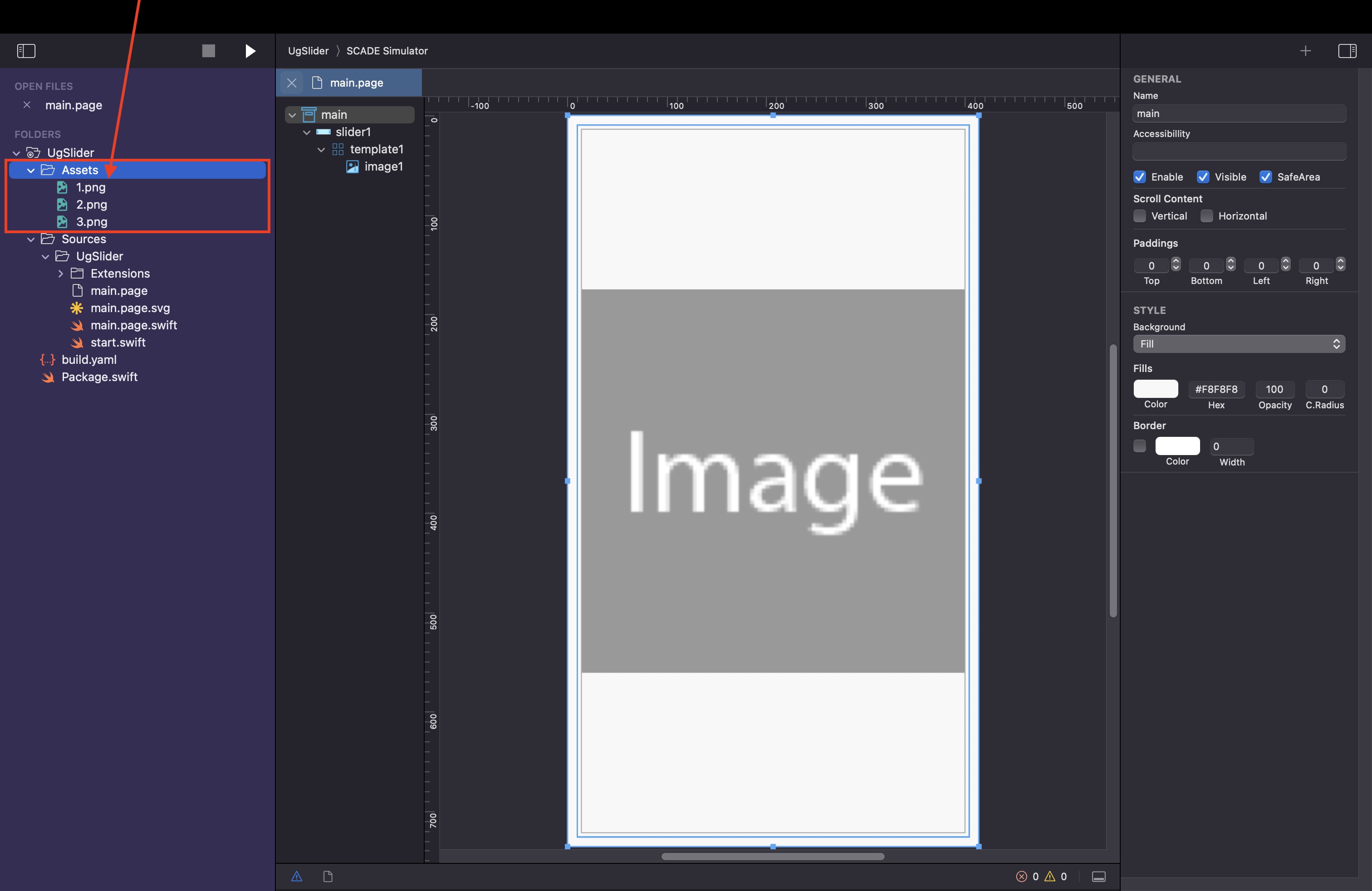
}Provide the Data Container with the image data:
Connect the items property of the slider control to the Data Container:
// items contain the mode of the slider, the data is displayed
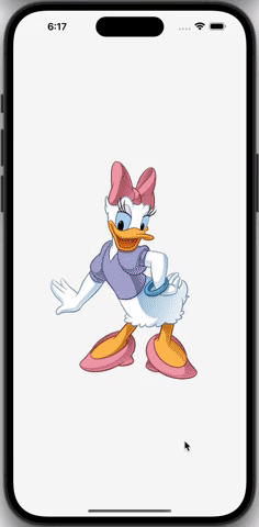
self.slider1.items = [Pic("1.png"), Pic("2.png"), Pic("3.png")]This results in
Capture slide event and slider positions
The event is of type SCDWidgetsSlideEvent and has the attributes to and from. In this example, we use to in order to get the url of the Pic object.
Using the items property you can access the next data object we are sliding to.
// Use the onSlide handler to capture slide events
self.slider1.onSlide.append(SCDWidgetsSlideEventHandler { e in print(e!.from, e!.to) })
Slide to a specific item
The item count starts at zero, so to goto 2nd item, set <sliderControl>.selected = 1. This property can only be used in the show() method, not the load() method.
override func show(view: SCDLatticeView?) {
  super.show(view:view)

  // selected works only within the show function
  self.slider1.selected = 1
}
Using a more generic element provider
You can use the raw SCDWidgetsElementProvider init() method to have access to more technical attributes
slider.elementProvider = SCDWidgetsElementProvider { item in
        guard let slider  = item?.target as? SCDWidgetsSlider,
              let pos = item?.position else { return nil }

   guard let newElement = slider.template?.copyControl() as? SCDWidgetsGridView,
      !newElement.children.isEmpty,
      let image = newElement.getWidgetByName("image1") as? SCDWidgetsImage else { return nil }

   image.url = "Assets/\(pos + 1).png"
   image.contentPriority = false

   return newElement
}
Updated 3 months ago